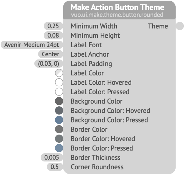
Creates a theme to be used when rendering action buttons.
Minimum Width, Height — The minimum size of a button’s background area (not including its border). Depending on the individual button’s Label text, it may exceed this size.Label Font — The font to use for the button’s Label text.Label Anchor — How to align the text relative to the button’s background area.Label Padding — Additional space to be added to the background on the horizontal and vertical axes, in Vuo Coordinates.Label Color, Hovered, Pressed — The colors for the button’s Label text, respectively, when not interacting with it, when the mouse is hovering over it, and when the button is being pressed. (The Label Font also specifies a color; that color is multiplied by each of these colors.)Background Color, Hovered, Pressed — The colors for the button’s background area.Border Color, Hovered, Pressed — The colors for the button’s outline.Border Thickness — The size of the button’s outline, in Vuo Coordinates.Corner Roundness — How rounded the corners of the button are. A value of 0 means the corners are sharp, producing a rectangle; a value of 1 means the corners are fully rounded, producing a circle (if the width and height are equal) or a capsule (if the width and height differ).Keywords: gui, interact, interface, user interface