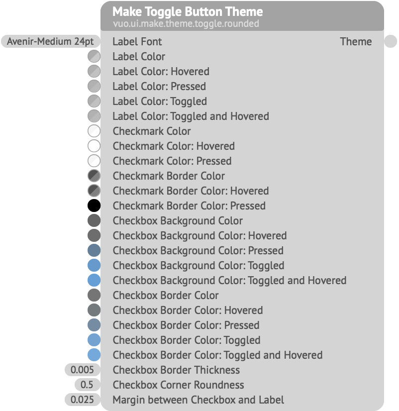
Creates a theme to be used when rendering toggle buttons.
Label Font — The font to use for the button’s Label text.Label Color, Hovered, Pressed, Toggled — The colors for the button’s Label text, respectively, when the toggle is turned off and the mouse is not interacting with it, when the mouse is hovering over it, when the button is being pressed, and when the toggle is turned on. (The Label Font also specifies a color; that color is multiplied by each of these colors.)Checkmark Color, Hovered, Pressed — The colors for the checkmark’s central area, when the toggle is turned on.Checkmark Border Color, Hovered, Pressed — The colors for the checkmark’s outline, when the toggle is turned on.Checkbox Background Color, Hovered, Pressed, Toggled — The colors for the box’s central area, behind the checkmark.Checkbox Border Color, Hovered, Pressed, Toggled — The colors for the box’s outline.Checkbox Border Thickness — The size of the box’s outline, in Vuo Coordinates.Checkbox Corner Roundness — How rounded the corners of the box are. A value of 0 means the corners are sharp, producing a rectangle; a value of 1 means the corners are fully rounded, producing a circle (if the width and height are equal) or a capsule (if the width and height differ).Margin between Checkbox and Label — The space between the box and its Label text, in Vuo Coordinates.The sizes of the checkbox and checkmark are determined by the line-height of the Label Font.
Keywords: gui, interact, interface, user interface