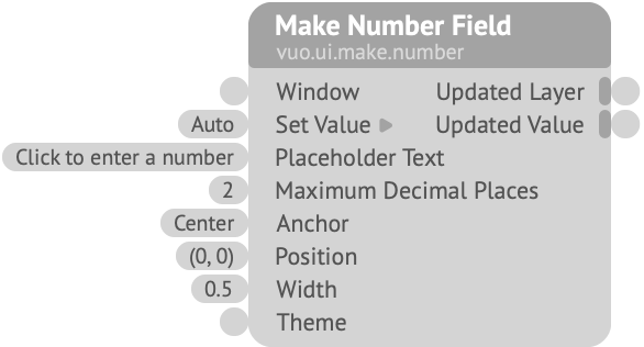
Creates a layer that provides a field into which the user can enter a number.
Window — The window in which the layer is rendered. Connect this to the Render Layers to Window node’s Updated Window output port.Set Value — Sets the initial numeric value, or changes its current numeric value. If set to “Auto”, the field will have no value and will show the Placeholder Text.Placeholder Text — The text to show in the field when no input has been entered.Maximum Decimal Places — The maximum number of digits to allow to the right of the decimal point. If fewer digits than the entered number, the number is rounded. If zero, the field omits the decimal point.Anchor — The point within the layer that should be fixed at Position. For example, if Anchor is Top Left, Position represents the top left corner of the field’s outer rectangle.Position — The field’s position, in Vuo Coordinates.Width — The size of the field (not including border), in Vuo Coordinates. The field will expand, if needed, to accommodate the numeric value or placeholder text. The height is automatically determined from the line height of the theme’s font.Theme — Information about the field’s appearance. See the Make Text Field Theme (Rounded) node.Updated Value — Fires with the initial number (if it’s not “Auto”), and when the user finishes editing the number (by clicking outside the number field, or pressing Return, Enter, Tab, or Esc) if the number changed (and isn’t empty).Keywords: bang, control, digit, edit, enter, events, fire, form, gui, input, interact, submit, trigger, type, user interface, widget, write