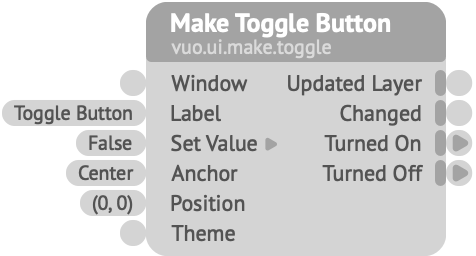
Creates a layer that can be toggled on/off, and fires an event when it’s changed.
Window — The window in which the layer is rendered. Connect this to the Render Layers to Window node’s Updated Window output port.Label — The text to show next to the checkbox.Set Value — Sets the initial status of the toggle, or changes its current status.Anchor — The point within the layer that should be fixed at Position. For example, if Anchor is Top Left, Position represents the top left corner of a rectangle circumscribing the toggle button and its label.Position — The toggle button’s position, in Vuo Coordinates.Theme — Information about the toggle button’s appearance. See the Make Toggle Button Theme (Rounded) node.Keywords: bang, checkbox, checkmark, control, enable, events, fire, gui, interact, off, on, switch, tick, trigger, turn, user interface, widget